In our last post, we introduced you to our ongoing L/E Journal series on the Elements and Principles of Design by discussing balance and harmony. For the second chapter, we’re focusing on scale and proportion. Just as the last post, we’ll begin with definitions to understand scale and balance in a design context.
scale (n) \ˈskāl\
Overall size; such as the largeness or smallness of a room, object or pattern.
pro·por·tion (n) \prə-ˈpȯr-shən\
The size relationship or ratio of parts to whole, such as the size of a chair in relation to the size of its arms.
It is closely related to scale. When the relationship/ratio is pleasing to the eye, it is well proportioned.
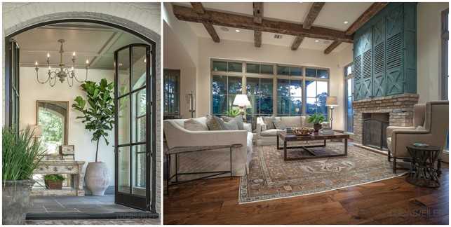
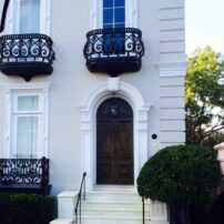
This first home with wonderful views overlooking the golf course at Houston Country Club presented an opportunity to work on a project that perfectly illustrates the use of scale. We enjoyed every minute of working with this client who has a degree in graphic arts and a deep understanding and appreciation of the principles and elements of design. The project architect, Dillon Kyle of DKA is a genius when it comes to design and scale, so our meetings were spirited collaborations of drawings and ideas. In the photo above (left), you can see that we paneled the ceiling of the new foyer to give it a personal scale and warmth. Likewise, the antique beams which create a grid pattern on the ceiling of the family room (right) make the sizable scale of the space seem more intimate.
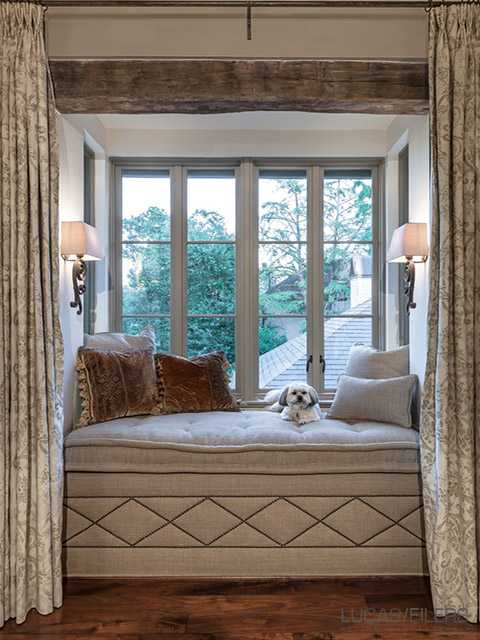
To contrast the volume of the vaulted ceiling in the master bedroom, we created a snug little window seat reading nook with a French mattress cushion and draperies for comfort and quiet moments.
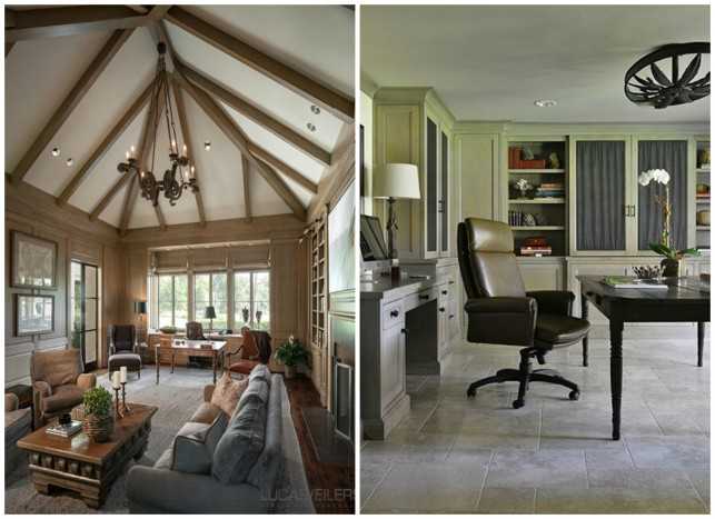
Another example of scale can be found in the custom chandelier that hangs in the study on the left. The study ceiling soars to almost 20 feet, so the scale of the light fixture needed to be significant. We found four substantial iron fragments in our local artisan’s stash of antique elements which we fabricated into a unique fixture. On the other hand, in the study on the right, an antique chandelier that we spotted in the Marche in Paris inspired the custom pendant light over the desk which fits the proportion of the lower ceiling.

In this home, the glass top of the coffee table in the great room allows the table to be the correct scale for the room without being too heavy. To give you an idea of the scale of this room, one of our designers can almost stand inside the fireplace opening. Because the mantel was so high; we needed a smaller piece of art over the fireplace; so we added the large wooden carvings to the left to balance the scale of the mantel.
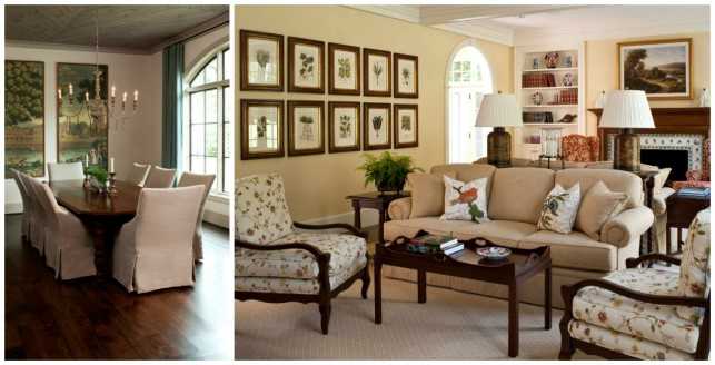
In the dining room on the left, we commissioned a pair of custom DeGourney wallpaper panels and framed them to be used as the focal point because ordinary art would have been too small for the scale of the room. We decided to use the clients’ existing dining room chairs in their breakfast room so we could justify ordering these new high backed chairs which better relate to the 11’ ceilings. In the family room on the right, a series of 10 leaf prints fill the negative wall space in a way that make the room feel complete.
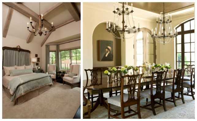
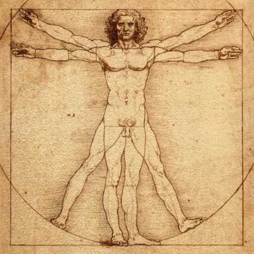
The most important consideration is how your design compares to human scale. In our office, we add an image of an average height person in almost every elevation we draw to see where eye level will fall. This was helpful in designing the draping behind this bed to ensure the scale would feel comfortable and not overwhelming (left). Creating well-proportioned spaces that are pleasing to the eye was the goal for this house in Virginia. Our client wanted to use her favorite portrait painting in the dining room which was a little smaller than we would have liked, so we painted the niche the same darker color of the ceiling to make the composition feel proportionate to the space (above right).
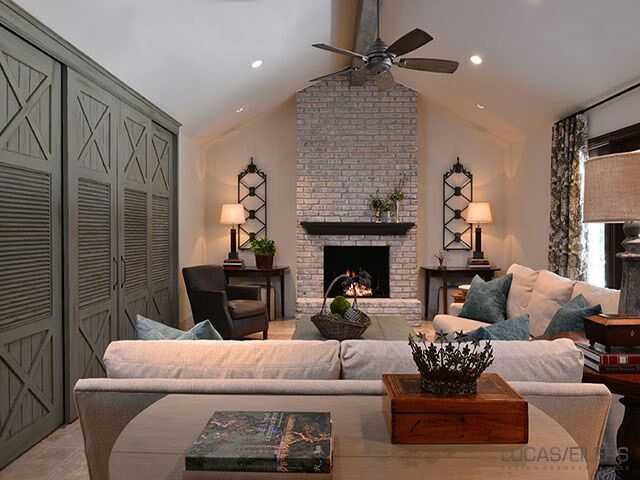
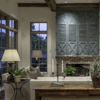
For this client, we had the dark brick on the fireplace in the family room white washed to bring it closer in color to the walls. With less contrast, the proportion of the fireplace seems more in keeping with the scale of the room.
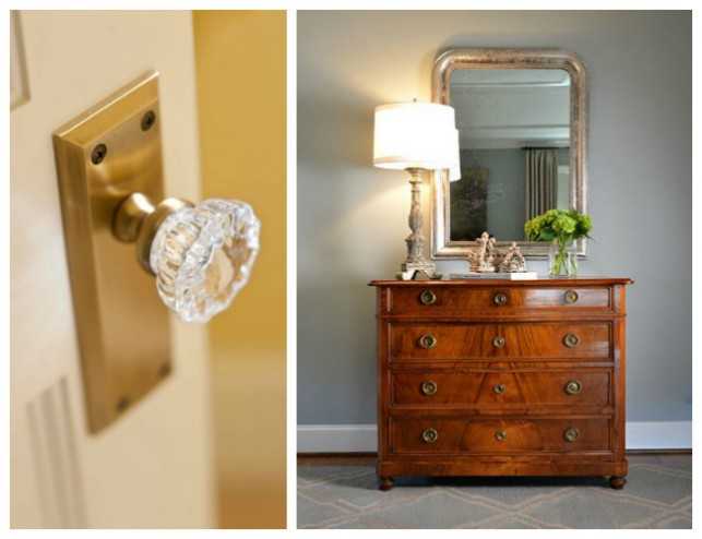
Often people focus their attention on the proper scale and proportion of furniture, leaving details like hardware and miscellaneous décor in the dust. An enormous grand door needs hardware that can rise to the occasion, while a delicate vanity might call for some dainty glass knobs. Likewise, heavy and dark case goods should have lamps that balance the weight, as in the photo on the right. Don’t make the mistake of placing a mini night light on a 150 pound wooden chest.
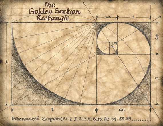
Often, when design feels “off” and we just can’t put our finger on what it is, it’s correct proportion that is missing from the equation. It’s a subtle but hugely important facet of good design. We find it helpful to study historic architecture and furnishings for pleasing proportions or examples of the “golden mean” or the “golden section.” We all feel a “sense of rightness” when good proportion is evident.
“Scale and proportion give everlasting satisfaction that cannot be achieved by only icing the cake.” – Billy Baldwin