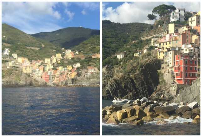
The inspiring and scenic Ligurian coast is a fantastic place to explore the elements and principles of design. The composition and construction of the colorful Cinque Terre villages beautifully illustrate form and mass.
9 months ago we began a quest to define and explore the elements and principles of interior design. We’ve covered balance, harmony, scale, proportion, rhythm, texture, pattern, color, line, space, shape, and light in previous blog posts. Today, we’re wrapping up the series by discussing form and mass.
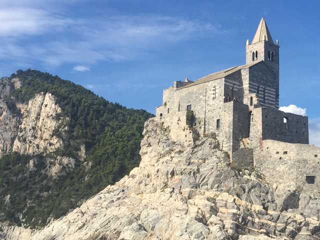
A view of the Church of San Pietro in Portovenere from Palmaria Island.
A recent trip to Italy to celebrate a family wedding has not only provided inspiration, but also photos to illustrate the exquisite forms and impressive mass that were evident at every turn along the Ligurian coast. In this L/E Journal we want to share some favorite Italian buildings and interiors, while exploring three dimensionality and mass as it relates to design and architecture.
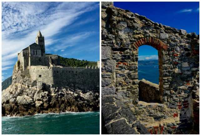
The church of San Pietro, which is situated on the Bay of Poets, was consecrated in 1198.
The church of San Pietro on the point at Portovenere seems to grow out of the rocks beneath it, making them appear as one giant form and creating a powerful and solid mass of stone and rock. From a distance, it’s nearly impossible to distinguish where the rocks end and the church begins, making it a dominant entity in the gulf. It is fascinating the way the church was designed with alternating layers of grey and beige marble to mimic the natural striations found in the cliffs below.
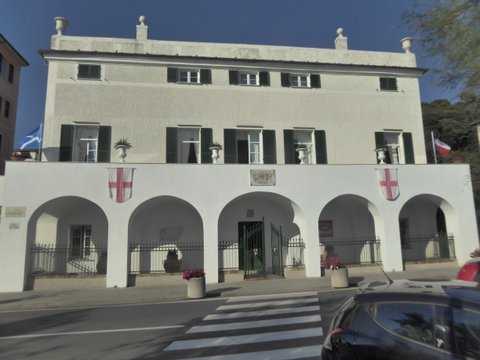
Percy and Mary Shelley lived at the Villa Shelley in 1822, hence the name.
The wedding took place at Villa Shelley in the picturesque town of San Terenzo. Built in the 16th century as a monastery, it was a charming form in itself. The rhythm of the portico’s arcade breaks up the mass of the building and gives it a symmetrical and harmonious façade.
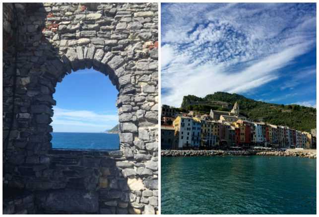
Lord Byron was fond of swimming from Portovenere to visit his friends the Shelleys in San Terenzo.
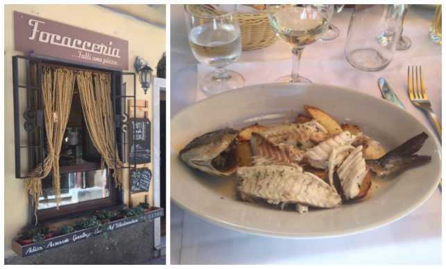
Left: Completely unrelated to form and mass – but these curtains made of pasta were too fun to be missed! Right: Also not to be missed…the incredible food and wine of the region.
The combination of fresh fish from the Bay of Poets, pasta, pizza, gelato, and local wines have nothing to do with form and mass, but certainly helped make the trip memorable! We had a delightful lunch at Gianni Franzi in Vernazza, where we were served one of the most delicious fish dishes, pictured above.
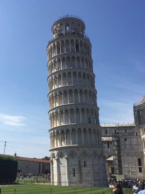
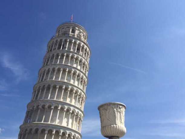
The remarkable Leaning Tower of Pisa is the free standing bell tower that accompanies the cathedral and baptistery. If you visit, be certain to reserve tickets in advance to climb to the top.
The Leaning Tower of Pisa is of course one of the most fascinating (and scientific) examples of form and mass. The tower, which has been leaning nearly 900 years, is surprisingly relatively stable despite its famous lean. As long as the vertical line drawn from its center of gravity passes through the tower’s base, it will not fall. Last year, engineers were able to straighten the tower roughly 19 inches.
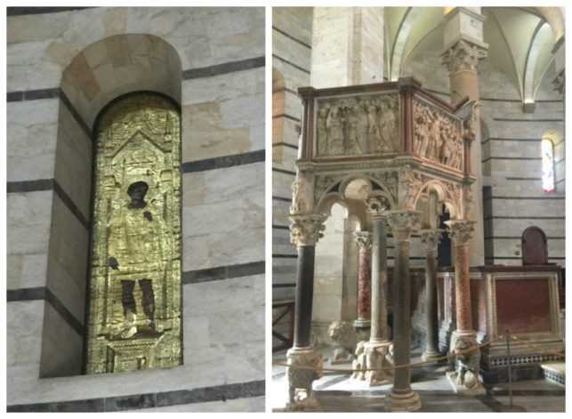
The interiors of the Baptistry of Pisa.
The Baptistry of Pisa gives us another great example of the power of the elements and principles of design. In the interior, the walls feature light and dark bands of contrasting marbles. Pattern on a surface, when consistent, creates the illusion of less mass. A solid object, on the other hand, appears to stand out in the foreground and gives the perception that the object carries more weight and has more mass. Thus, within the Baptistry of Pisa, the striped walls feel almost flat and weightless, while the stone columns carry the heaviness of the rising ceiling.
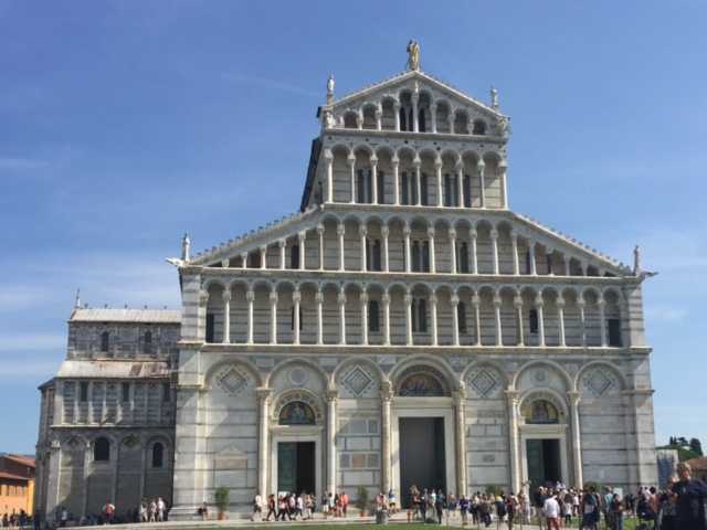
Cathedral Square in Pisa.
Everything in the cathedral – the high ceilings, the colossal columns, and striking ceiling — leads the senses upward toward the heavens and imparts a sense of spirituality to the viewer. Thoughtful use of form and mass within architecture very successfully creates emotion that complements the building’s purpose.
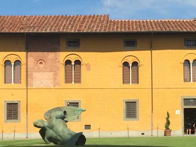
The form and mass of this incredible 20th century bronze sculpture in the Piazza Dei Duomo in Pisa was even more stunning against the vibrant yellow façade.
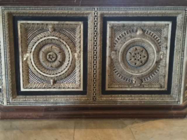
There was inspiration for current projects at every turn.
The forms and masses of Italy were inspiring to say the least and, we hope, make for an enjoyable conclusion to our series on the Elements and Principles of design. Stay tuned – next month we celebrate the arrival of cooler weather, fall colors and Thanksgiving decor.
“You may have the universe if I may have Italy.” – Giuseppe Verdi”

